


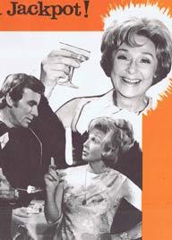
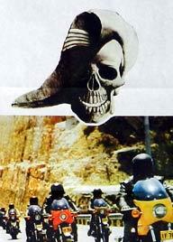
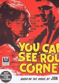


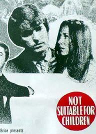


Featured Movie Posters – Updated Daily
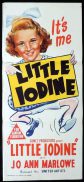
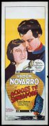
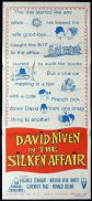
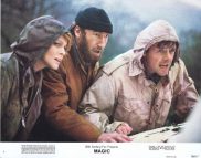
ORIGINAL MOVIE POSTERS
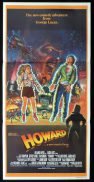
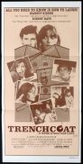
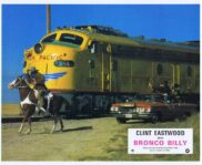
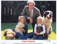
We buy and sell rare vintage original movie posters, lobby cards and Australian daybills, Australian Movie Posters and autographs.
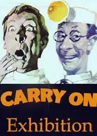
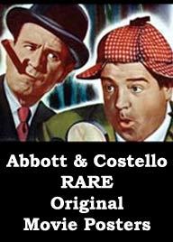
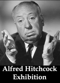
Moviemem Original Movie Posters showcases Australia’s largest and most comprehensive online retail collection of Original Movie Posters. We also have Guides to Original Movie Posters including Framing Tips and information about Linen Backing in our NEWS section. Many of the movie posters on the site are highly sought afer and extremely rare collectors items.
We specialise in original Movie Posters from Australian made films and Australian Daybills. We also have a large inventory in two ebay stores moviemem and moviepostercentral plus auctions on ozemovieposter
We are based on the Gold Coast in Queensland, Australia.